Showing posts with label Resources. Show all posts

Thursday, 30 June 2016

Creating A Children’s Picture Book Illustration Portfolio - Part 4 - Drawing Children

How do you draw children?  When creating a children’s picture book illustration portfolio, you need to have work that features children.  In a picture book, whether human, animal or robot, the main character is nearly always a child, this is something that I forgot to say in my blog post about format and content.  I have recently added these two new pieces to my portfolio and as you can see I have found it a challenge to make my characters look young, in fact it is difficult to work out what age they actually even are.    So, in this post, I aim to find out how to draw children.  
  
Red Meets The Wolf by Claire O'Brien

Bringing Home The Loot by Claire O'Brien


What Do The ‘How To’ Books Say About Drawing Children?
First port of call has to be some of the many ‘how to illustrate children’s picture books’ that are out there, to see what they advise about drawing children.


Observation
The consensus seems to be to observe children and draw them from life.  Uri Shulevitz says in his seminal Writing with Pictures: How to Write and Illustrate Children's Books
“It is best to draw from direct observation of nature - figures, landscapes, animals, plants, inanimate objects - as much as possible.  In this way you have clear references against which to compare and correct your drawings.  Artists who draw exclusively from imagination run the risk of drifting into vagueness.” (Shulevitz 1997, p136) 

As always, this is good advice as it basically boils down to ‘learn how to draw by drawing’. Below are some of my observational drawings, this is something I do as much as I can.  From our observational drawings of children what do we learn about how make our own children character designs that we use in our picture books look more childlike? 


My own observational drawings

Scale - Proportion Charts
After observation, the first thing that strikes me about children is their size, they look small next to adults and everyday objects.  So let’s look at children’s proportional anatomy first.  I’m not keen on the proportion charts in ‘how to draw for children’s picture books’ they are not objective enough for me.  I find there are better proportion charts in regular ‘how to draw’ books though most just show the adult male, some do have charts for the adult female and a few show comparisons between the genders and ages.

In my opinion, the most useful human anatomy proportion charts for Children’s Picture Book Illustrators are by Andrew Loomis.  We have to remember that proportion charts establish rules for an ‘ideal’ figure and are measured out using a unit that is relative to the size of the figure's head. Loomis' ideal is an adult of eight heads high, in reality the adult is probably seven and a half heads high.  The demarkation of where the eight head units fall on the body, line up with body landmarks such as the nipples, the navel, the elbows, etc and that helps us learn the proportions of the ideal figure. 


Loomis' adult male and female 'ideals' from Figure Drawing For All It's Worth


Beware when using some proportion charts, for example, while How to Draw Comics the Marvel Way is a great ‘how to draw’ book its eight head ideal proportion chart is a bit illogical to actually use, it has extra arbitrary proportion lines added at the neck and feet.
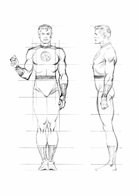


Also a lot of proportion charts state that women are seven and a half heads high to show that they are often shorter than men.  Again I prefer Loomis' method of an eight headed high female ideal.  Using seven and half heads makes it difficult to memorise where the subsequent head unit demarkations fall. I think the solution to drawing women shorter than men is to make their heads slightly smaller, as shown below, the red line shows the measurement of the women's head.  I might be wrong in doing this, what do you think?


Comparative Proportions
Okay so now that we are familiar with adult proportions how do they compare with children’s proportions? If we were to increase a child’s height to an adult’s we see instantly they have differently proportioned anatomy as the picture below shows.


As Loomis shows us below children's heads are smaller than adults' but they are larger in proportion to their own bodies. Children are not eight heads high, the numbers of head units vary at different ages starting with just 4 at one years old, 5 at three years old, 6 at five years old and 7 at ten years old. Arms and legs are relatively very short between one and three years old and he neck doesn't start showing until five when the shoulders start to widen. 


As well as covering whole body anatomy in Figure Drawing For All It's Worth Loomis goes into great detail about drawing babies, small children, school age children and teenagers' heads and hands in Drawing The Head And Hands.


From Further Reading
As well as Loomis' proportion charts there are some great written tips about drawing children;

In William Rimmer’s very unusual Art Anatomy book he gives this formula for drawing children:

  • Large head
  • Rounded cheeks
  • Short neck
  • High, narrow shoulders
  • Rounded abdomen
  • Narrow pelvis
  • Limbs large in proportion to small hands and feet

And in Barbara Bradley’s brilliant book Drawing People she says;
  • Babies' heads are very square both from the front and in profile.
  • Babies have a wider space between the eyes than adults.
  • Babies' cheeks reach down to the chin and sometimes farther.
  • Most babies have a lot of fat, it's pretty much gone by the time they are seven.
  • The curve under babies' chins is convex.
  • Missing teeth happen at around seven years old.
  • Babies have fat hands and feet.


My Own Observations
Here are my own observations I have made while drawing children from life, they have:


  • Large foreheads
  • Big eyes, wide apart
  • Transparent eyebrows
  • Upper lips that are more prominent than the lower
  • No lines or wrinkles on the face
  • No or a short neck
  • Chubbiness
  • Short arms
  • Big nappied-bottoms

Conclusion
So hopefully I have given you some useful things to think about and apply when drawing children for a children's picture book illustration portfolio, do let me know in the comments and also if you have anything to add.  I have certainly found this research useful and have made the following couple of watercolours as a result:

A two year old by Claire O'Brien

An eight year old by Claire O'Brien


Further Reading/Viewing

  • Check out Stan Prokopenko's Videos they are an essential guide to drawing human anatomy and proportion, and drawing in general.
  • This TEDx talk The Myth Of Average made me think of the 'ideal'. Just as the 'ideal' doesn't exist neither does average.  We all have a 'Jagged Size Profile' and this is something to bear in mind when drawing in individuality into our characters.
  • And finally, below, is a great real-life example of an Art Director, Lauren Rille, giving feedback on illustrator Robert Neubecker's initial illustrations on how to make the portrayed children more childlike in Sarah WeeksSophie Peterman Tells The Truth.


Lauren Rille's Feedback to Robert Neubecker on his initial Character Designs


Lauren Rille's Feedback to Robert Neubecker on this Spread

Monday, 9 May 2016

SCBWI Workshop Report - Getting Your Picture Book onto the Page With Elizabeth Dulemba

Last weekend I escaped my duties as a Mother and took a train up to Edinburgh to join the South East Scotland SCBWI Network for a Picture Book Workshop with the wonderful Elizabeth O Dulemba.

Sketching at the station
Elizabeth is an amazing writer, illustrator and teacher from the US, who we are lucky to have access to here in the UK (and the North especially!) as she has recently moved to Edinburgh to further her studies. Watch her inspiring TEDx talk about how she sold or gave away nearly everything she owned to pursue her dreams. 


The Workshop

It was a really useful and productive workshop, with a mixture of exemplar picture books, story analysis, folding paper, lots of folding paper, writing, pitching and drawing.  There was a lot of information crammed in and I was surprised to find that by the end, I’d roughly storyboarded the manuscript that I took along.  It was a pleasure and enlightening to see the collection of professionals’ storyboards that Elizabeth showed.  I now want to check out the gorgeous work of Ruth Sanderson whom I was previously unfamiliar with, click on that link, you won’t be sorry that you did.  Elizabeth brought along some of her own picture book dummies (mock ups) which were exquisite.  Sadly we ran out of time at the end to make our own dummies but Elizabeth has a pdf resource on her website to help.

Folding a zine

My Storyboard
So what I will take away from the workshop is a way to look at my texts to define the essence of them, then break them down into four key structure parts, and from there into a further eight parts and then finally seeing them as a whole of 14 spreads/32 pages to eventually taking them to dummy for reading out loud and page turning in the real world.

Sociable SCBWIs

It was a fun-packed, educational time and as SCBWI’s are a sociable lot I joined them for a post-workshop drink to talk even more about children’s book writing and illustrating and despairing at how long it takes to succeed.  It was lovely to hear about Sheila Averbuch’s journey and her signing with her agent.  Sheila highly recommended doing Writer’s Digest courses with access to editors and agents so I’m strongly considering trying an appropriate one to me, if I do, I’m sure to report back.

Sunday, 31 May 2015

02 - Spread Of Wonder: Oh No, George!

This is the second post in my series ‘Spread Of Wonder’ where I talk about spreads from picture books that I admire, I look at them and analyse why I think they make a good spread.  This month’s spread is the 6th spread of Chris Haughton’s “Oh No, George!” which was published in 2013 (in paperback) by Walker Books.  

The cover of "Oh No, George!" by Chris Haughton
The minimal art in “Oh No, George!” could not be more different to the intricately detailed art in last month’s spread from “The House in the Night”.  The main reason that I have chosen it is its excellent demonstration of sequentiality.  If you have been reading my “Creating A Children’s Picture Book Illustration Portfolio” blog posts, you’ll know that being able to successfully show storytelling and characters in sequence is a requirement of picture book illustration and something I’m aiming to get better at. 

The story of “Oh No, George!” is about a dog who is left home alone and promises to be good but he just can’t help himself.  It is beautifully structured with a setup of things that could go wrong, followed by a pause with the 'What will George do?' question, then the page turn reveals the results of George’s actions alongside the 'Oh no, George!' refrain. 

In this Spread of Wonder where George sees Cat, we see three depictions of George across the spread, two on the verso (lefthand) page and one on the recto (righthand) page.  And just like in "The House in the Night" spread last month, the direction of George’s actions are moving us forward left to right, through the story with him either moving to or looking towards the right.  


The spread has a white background with some minimal lines suggesting the location of the last spread; the floor and some remains of cake.  Haughton uses a flat, cutout style with bold colour and strong silhouettes, this is accentuated by him using no outlines (apart from on George’s eyes).  Like most artists working in a flat style he does not use light and shade to model the shadow of three-dimensional form but his colouring is far from flat.  George is red but he has a slightly lighter underside and a purple nose and there is always a pencil scribble somewhere on him.  I think the colouring is digital and rather than using Adobe Photoshop’s gradient feature I think Haughton has used the cutout technique for colouring too, as we see the straight edges where the colour subtly changes.

As I have already stated I have chosen this spread because it excels at sequentiality both within the spread itself and in context of the whole book.  This spread comes after George has eaten the cake that he shouldn’t have and before he chases Cat. The previous and following spreads show George’s chaos in full colour backgrounds which contrast with our spread which has a white background.  Unlike comics, picture books don’t often use panels to show sequence.  George is shown in differing sizes on the white background and this change in scale somehow visually signals to us that is a sequence and not three different dogs.  George is drawn consistently regardless of his different poses, he doesn’t change colour and his proportions don’t change, this also confirms that we are looking at a sequence of the same dog. 

Previous Spread


Following Spread
What can the aspiring illustrator learn from this spread of wonder then?  This spread teaches us a lot about Sequentiality and some of the elements that go into it: 
  • Show Contrast - in pose, size and mood when depicting a character in sequence 
  • Be Consistent - keep your characters and settings ‘on model’, don't change proportions, colours, etc. 
  • Establish a Rhythm - Haughton's example is a setup, a pause and the following results

Please comment with your own thoughts on this spread, or make a suggestion for a future Spread of Wonder candidate for me to analyse and don’t forget to follow this blog to receive a notification of my next post.  Thanks for reading!


Sunday, 12 April 2015

01 - Spread Of Wonder: House In The Night

This post marks the first in a monthly series! I’m calling this series Spread Of Wonder and I’m going to talk about spreads* from picture books that I admire because it will be nice to share with you and because it will help me in my quest to become a Children’s Picture Book Author and Illustrator.  You can’t make picture books without reading them and really looking at them so this series will help me do that and analyse what makes a good spread.

 * - two facing pages of a book, see my Anatomy of a Picture Book video if you need more clarification

The first spread that I am looking at is the 8th spread; “all about the starry dark.” from the gorgeous, Caldecott-winning “House In The Night” written by Susan Marie Swanson and illustrated by Beth Krommes.  The copy I have is a board book that was published in 2011 by Houghton Mifflin Harcourt in the UK and I bought it from the Seven Stories bookshop where it just jumped off the shelves as being so striking.

The House in The Night - Spread of Wonder

The story, on its simplest level, is about a girl going home to her bed, reading a book and going to sleep as night falls.  It is so much more poetic than that, with beautiful language.  The girl is shown as reading the same book as we are, but for her the bird in the book comes to life and carries her through the night.  In fact that is what this spread shows.  In the top right corner we see the girl riding the bird as it spreads a blanket of darkness over the land.

As the book is about dark and light, day and night, what better way to show this with the bold black and white scraperboard technique, picked out accents of yellow?  Where Krommes needs tone, she makes lots of little marks. The closer the marks are together, the lighter the tone.  

Detail of The House in The Night - Spread of Wonder

I know from experience how difficult it is to work in scratchboard, not only physically in making tiring, little scrapes in the inked clay surface but mentally in how you have to draw in reverse, scraping the highlights of an object onto black.  It is also hard to repair the surface if you make a mistake and it is a nightmare to reproduce with lots of postproduction required.

 "This Crooked Way" Scratchboard by Claire O'Brien
"This Crooked Way" Scraperboard by Claire O'Brien

Formally, Krommes has flattened the perspective of the landscape, describing the hills as overlapping semi-circles.  The roads curve slightly over the hills to describe their 3D form.  She disregards diminution, things only get slightly smaller, the further away in the scene that they are.  This is a clever device as it makes the image full of detail for a child to immerse themselves in.  The blanket of dark is drawn over the landscape with an undulating outline and creates a beautiful contrast with the light ahead of it.  In the dark, the stars, house lights and car lights are picked out in yellow and in the light ahead, the yellow also accents the bird’s song, a washing line, car, roof, flowers and a sign.

How does this spread aid storytelling?  The direction of the bird is moving from the left to the right which is the norm for Western, linear story telling, so the spread moves us forward in the story.  If we look at the preceding spread we see that it follows a close, dynamic shot of the bird and girl flying out of the window, which shows a clear change in location and makes them two very different spreads. This is unlike the following spread, where, although seen from a different angle, the bird is practically in the same position, same size and same location as it was before.

The House in the Night - Preceding and Following spreads.


What can the aspiring illustrator learn from this spread of wonder then? 
  • The physical Direction of the action contributes to the narrative of the story
  • Perspective - simplification and lack of diminution aids creating detail
  • Limited Palette - The black, white and yellow are very striking

You can see Krommes’ working method here and read Carter Higgins’ feature on the book in her Design of the Picture Book blog

There is just so much for a child to look at and for an adult to admire in this beautiful book.  Please comment with your own thoughts on this spread, or make a suggestion for a future Spread of Wonder candidate for me to analyse and don’t forget to follow this blog to receive a notification of my next post.  Thanks for reading!

Friday, 27 March 2015

Creating A Children’s Picture Book Illustration Portfolio - Tips for Improving Your Portfolio - Part 3

This post continues my series about creating a children’s picture book illustration portfolio. First I covered quantity and quality and then I covered format and content. In this post I dig deeper into content and suggest some tips and tools for improving your work, I start by showing the new work I have added to my portfolio (if you just want the tips scroll down to the end of this post):

"The Four Seater", Gouache by Claire O'Brien

"Laughter in the Leaves" Ink by Claire O'Brien


"Boy at the Computer" Pencil by Claire O'Brien
"Boy at the Computer" Pencil by Claire O'Brien 

"Horsebox" Ink by Claire O'Brien
"Horsebox" Ink by Claire O'Brien 


In previous posts I established that my aims are to:
  • Produce work in a landscape format.
  • Produce consistent looking sequential images that feature characters doing different actions and showing different emotions.
  • Include more settings/backgrounds (move away from white backgrounds)

I have removed “When Mum Came Back”  because it is in portrait format and on a white background.  I have removed Jack Frost as, though it has a background, it is in portrait format and is too ‘Fantasy’ to stay (I may remake this image one day, as I would like to try and the capture a winter scene and the Jack Frost character more successfully and in a children’s picture book style).

“When Mum Came Back” Gouache by Claire O'Brien
"Jack Frost" Ink and Watercolour by Claire O'Brien
"Jack Frost" Ink and Watercolour by Claire O'Brien 

As a result of these changes, I have increased the quantity of my portfolio from six images to eight and hopefully raised the quality too.  The majority of the images are in landscape format now but I must aim for all of them to be.  The new illustrations don’t add enough action, the dogs in the horse box, the family on the sofa and the boy at the desk are all at static and at rest really.  Only the girls laughing in the leaves are mid-action. I’m not sure if I have successfully shown different emotion yet too with the new work, there is joy in the girls in the leaves and tiredness of the family on the sofa but neither of these are sequential which help show a change in their emotions.  Unfortunately there are no background settings in the new pictures so I have actually added more white space! 

My Portfolio at a Glance by Claire O'Brien


What tips will help me, and you, improve our portfolios?  Here are three suggestions:

Make Lots of Work! 
The more work you make, the more chances you’ll have of increasing the size and quality of your portfolio.  If the standard of your work is not yet portfolio-ready, making lots of work gets the bad stuff out, as Disney animator and drawing teacher, Walt Stanchfield said: 

“We all have 10,000 bad drawings in us. The sooner we get them out the better”.  

Making lots of work helps you practice your craft, you can only improve!  If you are stuck with what to make work about, draw from life so you do not rely on your style and what you think things look like, again this can only improve your work.


Look At The Best Work Currently Being Published!
Analyse what the illustrators and designers are doing in a children's picture book spread so that you can emulate it in your own work.  Look at the backgrounds, are the characters in white space or in a fully illustrated setting?  What sort of settings come up a lot?  Where are the characters placed in the spread?  Does it change depending on viewpoint? Long shots, closeups, bird’s eye views, etc. What are the characters doing? What do their poses, gestures and movement directions show us about what is happening in the story?  Does the character’s pose and expression convey an emotion?  Does the lighting echo the emotion, add to the mood?  Where has the illustrator left space for the text? Is it a white space or a quiet part of the illustration?  Is the illustration in duet with the text, showing what the text says or is it counterpoint and saying something different? 


Evaluate And Be Critical About Your Own Work!
Look at your work as a whole, add all of your portfolio images into one document and look at them on the screen or in a print out.  What stands out? Is it for good reasons or bad?  What similarities are there?  Look at the viewpoints you have used, where is your camera? Is it always close, far away, straight on?.  What are your backgrounds like?  Non existent like mine or fully realised?  Do you always use the same colour palette?  Is it always saturated or muted? Do your characters always face the front or the side but never anywhere in-between?  Are they always making the same pose or expression?  Do your characters look different to each other? Are they the same gender or age?  If all these things are similar, draw them differently to show variety and skill in your work.


Well, I still feel my portfolio does not quite fit the bill of a children’s picture book portfolio yet.  I’m going to follow my own tips and really focus on creating sequential images that feature characters doing different actions and showing different emotions in a background!  I’m also going to start a series of monthly posts called “Spread of Wonder” where I’ll present an example of a published children’s picture book spread that I admire and tell you why I think it is so great, follow my blog so that you get a notification of when I post it. And if you are stuck for what to actually draw check out these great suggestions from Robin Rosenthal.

Friday, 12 December 2014

Video Training for the Aspiring Picture Book Author and Illustrator

Christmas is coming, what do you get the Aspiring Picture Book Author and Illustrator in your life?   How about some training videos?  Here are my recommendations:


Claire O'Brien Art - Computer Boy and Cat
Computer Boy by Claire O'Brien


Craftsy
I had never heard of Shadra before taking this course, she’s a Picture Book Author and Illustrator working in a realistic style and she is a great teacher.  She provides useful information that she backs up with demonstrations.  I like her character development, setting and using reference sections.  The most valuable advice she gives, in my opinion, is on the framing of storyboard thumbnails and how you should think about their intended destination, the finished picture book, and whether that is portrait or landscape.  She also provides common picture book dimensions, information I’ve looked for for a long time.  Although I haven’t submitted any of my own work, it looks like Shadra is quite active in the member discussions and provides feedback on work posted.  This is the best video course that I have seen on writing and illustrating children’s picture books!  Buy this class here.

Skillshare
Picture Books I: Write Your Story by Christine Flemming
I really like the Skillshare’s courses, they focus on real-world, creative skills rather than what buttons to press in software, I have just bought a year’s membership after paying monthly for a while.  Picture Books I: Write Your Story by Christine Flemming (12 Videos, 54 minutes total) is a good course with solid information.  The course is delivered through slides and references well-known books as examples of good practice.  There is a set assignment and you can share your progress with the group or publicly and receive comments from peers and Christine  The lesson on rhythm is factually correct but it doesn’t help that it is delivered in a flat monotonous voice (pot calling the kettle).  You will find all of this information in any good children’s book writing how-to book but if you’d rather listen to the information then this video is for you.  Christine also has a follow-up course on illustrating your picture book that I plan on watching too.  Sign up for Skillshare here.

Lynda.com
Lynda.com has a whole of host of courses from using software, photography, creative business, design and animation and they are all really well-delivered and very useful.  They also make documentaries that are inspiring.  Two that are of interest to aspiring picture book authors and illustrators are:

Creative Inspirations: Ed Emberley, Children's Book Illustrator is amazing.  I probably don’t need to tell you about his drawing books for children which is how I know of him.  I didn’t know that he also writes and illustrates children’s picture books, he’s published over one hundred of them.  This video presents his philosophies and practice via an interview, footage of him drawing and voice overs.  It shows his studio and working methods which are always fascinating for a fellow artist to see.  It also features his daughter, Rebecca Emberly, who is also a picture book author and illustrator.   My favourite quote from this video is when he says “I just felt like doing a children’s book” and of course it was published!

Picture book apps on the iPad and tablets are difficult to ignore these days whether you like them or not.  If you want to venture into picture book apps then this documentary is very inspiring.  Stacey talks her about her varied background to how she has arrived at digital (and now traditional) picture book publishing and creation.  She clarifies what a picture book app actually is and shows how she creates her work traditionally in watercolour and brings it into the iPad via Demibooks Composer (a very good picture book creation app).  She also provides good advice on interactivity, what to make move, have sounds or how to react with touch.  After watching this I decided that one of my manuscripts will be ideal as an app so watch this space.

Don’t forget that watching these courses is fun and entertaining but if you don’t follow the advice and do the assignments you won’t learn.  And, full disclosure, if you click through my links to Craftsy and Skillshare and buy any of my recommendations above I will get a small referral fee, if you do, I thank you for your kind support.

Tuesday, 30 September 2014

Creating A Children’s Picture Book Illustration Portfolio - Where to Start? - Part 1

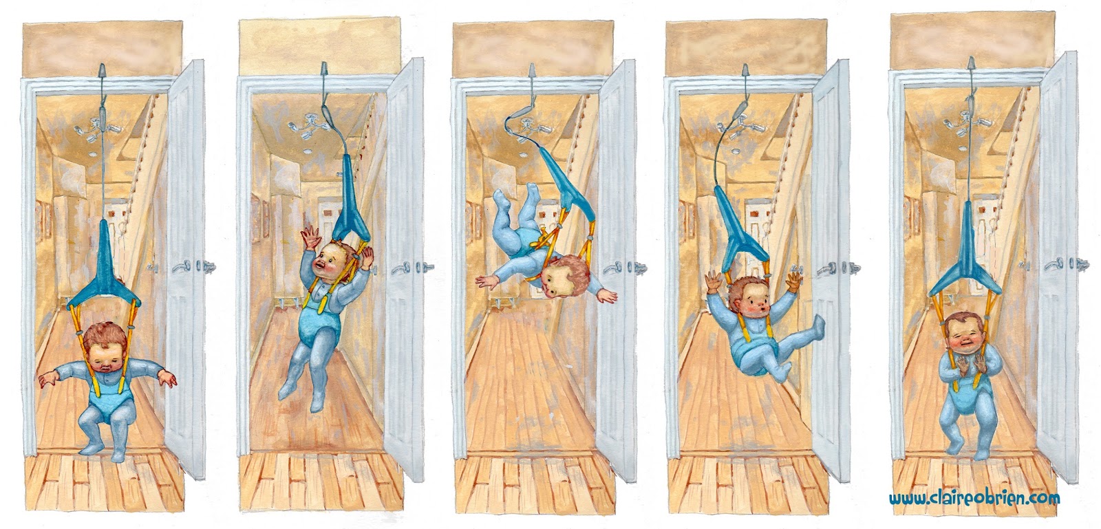
Baby Bouncer Children's Picture Book Art Claire O'Brien

I finished this illustration this week and added it to my portfolio.  I am hesitant to call my portfolio a ‘children’s picture book illustration portfolio’ at this moment in time, not because I am not yet published, but because I don’t think it quite fits the bill.  So how do you create a children’s picture book illustration portfolio?  Where do you start? 

Quantity
Fantasy and Children’s Book illustrator Kiri Østergaard Leonard, has an excellent checklist for illustration graduates:


Number 1 on her list is ‘Build a portfolio of 6 - 12 of your best pieces’.  This gives importance to quantity and quality.  If you have a large quantity of work it suggests that you are more prolific, practised, and perhaps, speedy.  She suggests a higher limit of 12 pieces, any more than that would be tedious for an art director or editor to look through.  Regardless of how many pieces of work are in your portfolio, if it doesn’t contain anything but your highest quality of work then it will be judged on the weakest piece.  Rather than putting in everything that you have ever done in your portfolio put in only your best pieces, 6 at the least.

Quality
How do you know what your best work is?  Ultimately you want to aim for your work to be at industry standard, that is, at the same artistic and technical quality as, or better than, children’s book illustration that is currently being published.  If, like me, you are currently unpublished then your aim should be to make better work than that in your existing portfolio. Try to identify what areas you can fix and improve upon; storytelling, anatomy, perspective, tone, colour, etc?  


In regards to my own portfolio, I need to work on all these areas but most importantly I need to address the image contents, are they fit for purpose?  Could you imagine them in a children’s picture book?  I will address this in my next blog post, so join this blog or follow me on Google + to get notification of when it’s posted.

Saturday, 30 August 2014

Picture Book Anatomy - How a Picture Book is Made Affects How you Write One.

When writing a picture book you need to be aware of their strict formatting which is dictated by how they are made.  Picture books are commonly made up of 32 pages, only it is not as simple as that, you don't have all of those 32 pages to tell your story.

Here is a video that I have made that examines picture book anatomy, its contents are:

00.00 - Introduction
00.19 - Hardcovers
02.50 - Softcovers
03.18 - Signatures, Spreads and Pages
06.07 - Self-ended Hardcover and Softcover Comparison
06.54 - Separate-ended book
07.37 - Conclusions
08.33 - Using this information to write your own picture books


Things I learned making this video are that Hardcovers sometimes have the same amount of pages as softcovers if they are self-ended, but more pages if separate ended.  I learned how to fold and cut a paper signature and how the pages are laid out, out of sequence due to the folds.  And most importantly that a 32 page picture book only has 13 spreads to work with rather than my previously thought 14.

The books featured in this video are:


The links featured in this video are:

My Youtube Channel

Tuesday, 24 June 2014

How to use my Scrivener Picture Book Template - A Free Video Tutorial

I have finally created a video tutorial for my Scrivener Picture Book Template which I released a couple of months ago. I hope that it is useful as it is my first go at demonstrating software on video. If it is please like it in YouTube and subscribe to my channel for more videos coming soon. If anything is unclear I’m happy to answer further questions and any other feedback would be welcome in the comments below, thanks.


Monday, 21 April 2014

Update! - Scrivener Picture Book Template for the PC


In my last blog post I shared with you my Scrivener Picture Book Template and I was pleasantly surprised to see that I had over 200 downloads!  I had some great feedback from the kidlit community, especially the Mac users among them.  It seems the file doesn't always open in a PC for Windows users.

So I've had a look at it and created a new version for Windows that looks closer to how it looks on a Mac.  I've also incorporated a comment from bungld to change the name of the manuscript folder from "Picture Book Template" to "Picture Book Manuscript" in keeping with Scrivener nomenclature.

I also suspect people may have trouble opening a zip file, if so here is a useful video to help you through the process.  Speaking of videos, I am currently working on my own tutorial video on how to use this template which I hope to post soon.  Here are the links to the Windows templates:


Monday, 31 March 2014

Writing a Picture Book in Scrivener - Free Scrivener Template

Isn’t Scrivener just the best writing app in the world?  It is so versatile and reasonably priced.  Many different sorts of writers use it for lots of kinds of work.  Personally, I’ve got the start of a Young Adult (YA) novel on the go, using the standard novel template that comes with Scrivener.  But what I really love to write are children’s picture books. Scrivener doesn’t come with a picture book template and I couldn’t find one online, so I made my own which I’m happy to share with you here on my blog:


The two different versions are formatted for US letter paper and UK A4 paper and while they open on a PC they don't look anything like they do on a Mac. I will produce a PC version soon.  Disclaimer, I’m not a published picture book author and I’m not a Scrivener expert, I’m aiming to be published and I just love using Scrivener and what it can do for me.

So once you've downloaded the zip file, extract and move the .scriv file to your writing folder and when you open it up it should look like this:


On the left, in the Binder window, we see a list of documents either entitled Spread … or Untitled Document.  As most picture book writers know, picture books adhere to a very strict form due to the way they are physically constructed.  The pages are printed, in multiples of eight, onto large sheets of paper, which are called a signatures.  So most modern picture books are told across fourteen double page spreads (each single page is a spread) totalling thirty two pages and the story usually begins on page four or five.  So in my template there are 14 Spread documents which serve, when writing your picture book, as headings to help you plan your page breaks.

The first document in the Binder is the Title Page, I have included this to help with submission to editors and agents. In the Editor window, in the middle, add your name, address, telephone number and email on the top left and the manuscript wordcount on the top right.  Your title of your picture book must be centred and wirtten in capitals, your name should be below that and then your story begins.  The template has centred page numbers in the footer and a right-aligned header of the Scrivener document file name (which you should name as your “surname - title” of your story). The whole template is formatted using SCBWI's recommended 12pt Times New Roman font, double line spacing and 1 inch margins. 

If you wish to write without the Spread headings visible in the manuscript, select only, by Command-Clicking the Untitled Documents in the Binder window as shown below:


The Corkboard view in Scrivener is really useful for plotting your writing, it is switched on by pressing this icon:


In the Binder, Shift-Click select the first Spread document and the last Untitled Document to display the Corkboard as I intend it:


Picture Books have a generally acknowledged plot structure consisting of a beginning, middle and end, three problems to solve, etc., so I have used this structure to create plot prompts that are visible on the Spread index cards in the Corkboard view.  You can then write synopses on the Untitled Document index cards and/or add images.  I have more to add on using the Corkboard which I will put in a video tutorial.  

Well I hope that this is useful to the Scrivener-using, picture book writers out there. Please check back soon for the PC version and a video tutorial on how to use the template.  Any feedback is welcome, especially if I need to fix something.  If it has been useful to you then please comment below, follow my blog, like my Facebook page, share on your own social media channels and send me a tip via Paypal:


Thanks for stopping by and thank you to Marcie Atkins, Michelle Cusolito, Darshana Khiani and Sian Mole for testing the template and the plot prompts can be credited to Rob Sanders.