Welcome to the third post in my ‘Spread Of Wonder’ series where I talk about spreads from picture books that I admire, I look at them and analyse why I think they make a good spread. This month’s spread is the 10th spread of David Lucas’ “The Robot and the Bluebird” which was published in 2007 by Andersen Press.
I do not know if David Lucas is a picture book superstar, but I personally, did not know of him until I recently came across this book in my local library. It is a beautiful, whimsical story of an old, broken hearted robot who is put on the scrap heap but finds new purpose and friendship when he shelters a weak, migrating bluebird in the cavity where his heart used to be. It is illustrated with dip pen ink lines and coloured with watercolour, somewhat a traditional media in children's picture books.
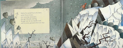
In this spread, the robot is at the hardest part of his journey, carrying the bird in his heart over a mountain. He is moving left to right in direction, moving us through the story just as we have seen demonstrated in my previous choices of Spreads of Wonder.
What is great about this spread for me is how the illustration of the setting contributes to the storytelling. The robot is crossing a mountain, a difficult thing to do at any time but even harder when it is raining and snowing like Lucas has drawn here. Again Lucas uses direction in the diagonal lines of the falling rain and snow, pelting down against the robot's back. Lucas has drawn grey thunder clouds that look like symbols from TV weather forecasts, with jagged arrowed, lightening coming from them, they are not soft and fluffy, they have hard outlines and their shading shows their solid form. The mountains are also pointed and jagged, as are the trees with their icicle spikes and bare twig branches suggesting danger everywhere.
Lucas use uses a limited colour palette to great effect in this spread using only washes of blue, black and red against the white of the paper. He uses the cool and muted blues, blacks and whites in the environment which contrasts starkly against the warm rust red of the robot. Apart from the clouds, as already mentioned, and perhaps the robot, Lucas hasn't really used the colour to describe the form of objects through shading, instead he applies colour as a bodycolour wash and uses the pen line to describe form. This seems to be an often-used technique in children's picture book illustration and I wonder if it just adds to the clarity for children?
What can the aspiring illustrator learn from this spread of wonder then? This spread teaches us mainly about using illustration to contribute to storytelling.
Storytelling - make the environment show the feelings of the story
Direction - Use physical direction of the action to move the narrative forward, left to right and show hardship and struggle with right to left direction
Use Contrast of colour temperature to highlight a character.
Direction - Use physical direction of the action to move the narrative forward, left to right and show hardship and struggle with right to left direction
Use Contrast of colour temperature to highlight a character.
Please comment with your own thoughts on this spread, or make a suggestion for a future Spread of Wonder candidate for me to analyse and don’t forget to follow this blog to receive a notification of my next post. Thanks for reading!

