Sunday, 30 November 2014

Creating A Children’s Picture Book Illustration Portfolio - Format and Content - What to Put In? - Part 2

In my first post on the subject of Creating A Children’s Picture Book Illustration Portfolio I talked about the quantity and quality of the images.  In this post I’d like to explore format and content, by that I mean what the actual images show and how they are presented.  I will use my findings to create action points for me to apply to my own portfolio as it presently stands.

The Format of Children’s Picture Book Illustrations
Based on my observation of current children’s picture books, illustrations destined for the printed page are mostly printed in landscape format, spanning double page spreads.  In the past we saw more of single spread images and spot images and these are useful if you need more than the allocated 32 pages to tell the story.  

The Content of Children’s Picture Book Illustrations
Illustrations in children’s picture books are sequential in that they have multiple images that tell a story that happens over time.  This means that there is a requirement to be consistent in their execution, characters have to be ‘on model’, that is they have to have the same proportions and features and wear the same clothes from page to page (unless the story dictates otherwise).  Colours have to match from image to image.  Locations and props also need to be consistent in the same way.  Sequential storytelling art by its nature shows characters doing lots of actions and having different emotions and feelings.  And again, unless the story demands it, the art is produced in a consistent same style and medium. 

Appraising the Format and Content of the Work in My Own Portfolio
Okay, here is what my portfolio currently looks like, as whole, as seen on my website:

Claire O'Brien Art Portfolio

Disregarding its quality, I have a minimum desired quantity of six illustrations, of mainly human subjects, painted traditionally with gouache on paper.  I also have a digital piece, an ink and watercolour and a scraperboard.  

Venice Children's Picture Book Art Claire O'Brien


This is a tonal gouache sketch of a spread from one of my picture books that I am working on.  I think it is the strongest piece of work in my portfolio as it is has storytelling and is in a complete setting that conveys mood and atmosphere.  This has been affirmed to me by its selection in the 2014 SCBWI (British Isles) Showcase Exhibition a goal that I expressed a wish to achieve back in July when I helped to hang the 2013 Showcase at Seven Stories.
Children's Picture Book Art Claire O'Brien


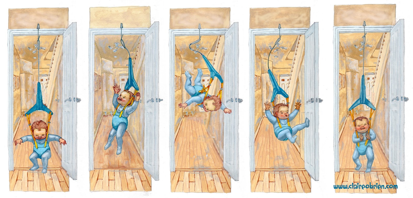
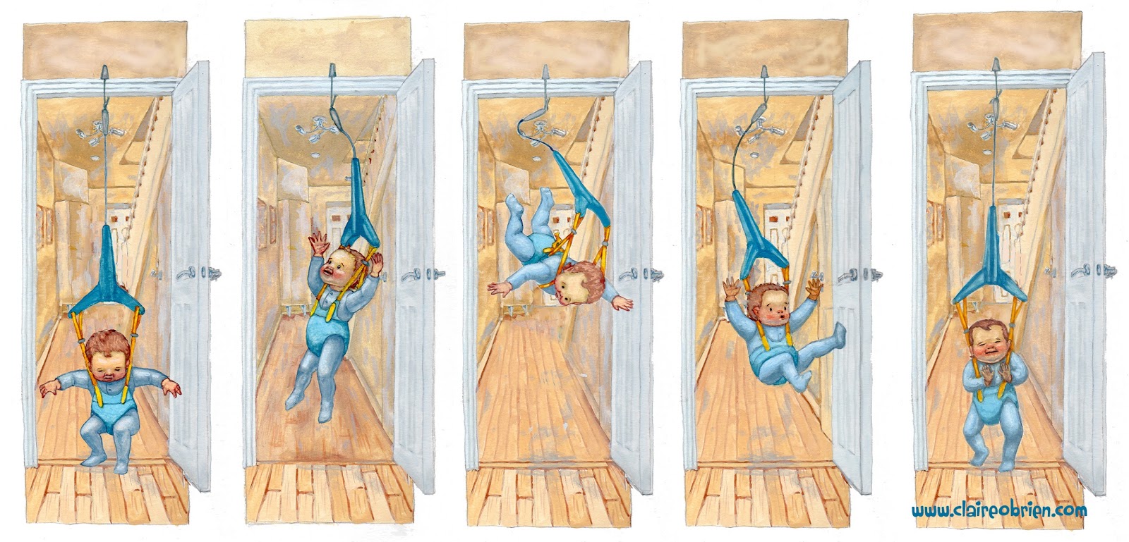
Baby Bouncer is painted in gouache with a touch of digital, set in an interior setting, it hopefully shows consistency in depicting a character and is sequential showing different emotions and action.

Claire O'Brien Art


When Mum Came Back is a gouache showing a group in exaggerated action, with different emotions.

Children's Picture Book Art Claire O'Brien


Outdoor Girl and Sidekick is me trying to capture my gouache style digitally.  I like the characters but I'm not sure of their emotions here, they're perhaps a bit neutral.

Jack Frost Art Claire O'Brien


Jack Frost is painted with ink and watecolour and is me attempting to draw like Arthur Rackham. Things in favour of this illustration are that is set in a forest setting and I like the rendering of the body.  The storytelling not quite there and the aesthetic is perhaps more fantasy than picture book. 

Art Claire O'Brien


This Crooked Way is a scraperboard and I like the design style dictated by the medium, but it would need refining if I were to do more of these.   Again perhaps the aesthetic is more fantasy than picture book.

Action Points
So here are my conclusions about the format and content of my children's picture book illustration portfolio and some suggested action points to implement in order to improve it, who knows they may apply to your own portfolio:
  • Produce future work in landscape format.
  • Produce consistent looking sequential images that show characters doing different actions and showing different emotions.
  • Include more settings/backgrounds (move away from white backgrounds)

Further Reading
Here are some good links to what others have to say about children's picture book illustration portfolios:
  • Lynne Chapman's professional view on character and characterisation
  • Donald Wu gives his professional opinion for ordering your portfolio and good advice on style and content.
  • Eliza Wheeler shares her SCBWI feedback on improving her portfolio.

Friday, 31 October 2014

#Inktober - The Benefits of Participating in an Online Challenge

Inktober is a drawing challenge to make one ink drawing a day for the entire month of October.  Inktober was started in 2009 by an artist called Jake Parker, who set himself the challenge to improve his inking skills and develop positive drawing habits.  This, 2014, is the first year that I have taken part in it and my own motives were similar to Jake’s, they were:

    • to get better at drawing with ink
    • to produce a drawing a day
    • to generate images for my Facebook art page

I am pleased to say that I completed the challenge as this video of my Inktober drawings shows:


So what were the benefits of doing this?  Firstly in my work, I got comfortable drawing with ink, without a pencil sketch as a foundation.  My main discovery is that it’s best to draw what is closest to you first, that which overlaps on your subject rather than starting with the general large shapes as you would when drawing in pencil.  This one touch way of drawing was scary but liberating.  I found it easier than I thought to produce a drawing a day, so much so that I plan on keeping the habit up, but not necessarily using just ink. The challenge also served the purpose of content for my Facebook art page and Twitter and Google + too.  The drawings were often of things I did that day so they became like a journal.

There were benefits to doing Inktober in Social Media rather than just through my blog or website.  I don’t currently have many likes for my art page (just under 150) so these numbers won’t sound impressive but according to Facebook I had at least 50 to 200 people seeing individual drawings.  I’m not sure how many saw them on Twitter and Google +.  I would on average get 6 likes per drawing Facebook, a couple of favourites on Twitter and a couple of +1s on Google +.  The Facebook and Google + likes and +1s tended to be from friends and acquaintances but strangers favourited on Twitter.  Best of all I have been approached to produce some prints of some of the drawings and commissioned to make a drawing in my “Inktober” style.

Some lessons learned are that:

    • Popular drawings were the ones that feature pop culture such Day 11 of my son dressed as Darth Vader and Day 28 of Michael Jackson in Thriller.  

    • Two hash tags (including #inktober) in Twitter would often get retweets and favourites. Tweeting someone specifically generally didn’t.
    • Next time I will embed File Info from Photoshop rather than uploading from my phone and I will include a visible URL back to me as some images have turned up on various blogs and have been shared.

So overall it was a really worthwhile challenge and I will definitely do it again next year.  Next up is Tara Lazar’s PiBoIdMo - Picture Book Idea Month.


Tuesday, 30 September 2014

Creating A Children’s Picture Book Illustration Portfolio - Where to Start? - Part 1

Baby Bouncer Children's Picture Book Art Claire O'Brien

I finished this illustration this week and added it to my portfolio.  I am hesitant to call my portfolio a ‘children’s picture book illustration portfolio’ at this moment in time, not because I am not yet published, but because I don’t think it quite fits the bill.  So how do you create a children’s picture book illustration portfolio?  Where do you start? 

Quantity
Fantasy and Children’s Book illustrator Kiri Østergaard Leonard, has an excellent checklist for illustration graduates:


Number 1 on her list is ‘Build a portfolio of 6 - 12 of your best pieces’.  This gives importance to quantity and quality.  If you have a large quantity of work it suggests that you are more prolific, practised, and perhaps, speedy.  She suggests a higher limit of 12 pieces, any more than that would be tedious for an art director or editor to look through.  Regardless of how many pieces of work are in your portfolio, if it doesn’t contain anything but your highest quality of work then it will be judged on the weakest piece.  Rather than putting in everything that you have ever done in your portfolio put in only your best pieces, 6 at the least.

Quality
How do you know what your best work is?  Ultimately you want to aim for your work to be at industry standard, that is, at the same artistic and technical quality as, or better than, children’s book illustration that is currently being published.  If, like me, you are currently unpublished then your aim should be to make better work than that in your existing portfolio. Try to identify what areas you can fix and improve upon; storytelling, anatomy, perspective, tone, colour, etc?  


In regards to my own portfolio, I need to work on all these areas but most importantly I need to address the image contents, are they fit for purpose?  Could you imagine them in a children’s picture book?  I will address this in my next blog post, so join this blog or follow me on Google + to get notification of when it’s posted.

Saturday, 30 August 2014

Picture Book Anatomy - How a Picture Book is Made Affects How you Write One.

When writing a picture book you need to be aware of their strict formatting which is dictated by how they are made.  Picture books are commonly made up of 32 pages, only it is not as simple as that, you don't have all of those 32 pages to tell your story.

Here is a video that I have made that examines picture book anatomy, its contents are:

00.00 - Introduction
00.19 - Hardcovers
02.50 - Softcovers
03.18 - Signatures, Spreads and Pages
06.07 - Self-ended Hardcover and Softcover Comparison
06.54 - Separate-ended book
07.37 - Conclusions
08.33 - Using this information to write your own picture books


Things I learned making this video are that Hardcovers sometimes have the same amount of pages as softcovers if they are self-ended, but more pages if separate ended.  I learned how to fold and cut a paper signature and how the pages are laid out, out of sequence due to the folds.  And most importantly that a 32 page picture book only has 13 spreads to work with rather than my previously thought 14.

The books featured in this video are:


The links featured in this video are:

My Youtube Channel

Wednesday, 9 July 2014

The I in SCBWI - Illustrators!

Yesterday saw the visit of illustrators and SCBWI members Anne-Marie Perks and Bridget Stevens-Marzo to Seven Stories, The National Centre For Children’s Books.  They were here to hang the SCBWI Showcase exhibition that was launched as part of SCBWI’s annual conference last year.  Me and fellow north-based SCBWI members (Maureen Lynas, Cathy Brumby, Lucy Farfort and Alex Wilson were there to help, support and of course, socialise with them.

In front of part of the exhibition.
Left to right - Maureen Lynas, Alex Wilson, Anne-Marie Perks, Bridget Strevens-Marzo, Cathy Brumby and Me.
Photo by Geoff Lynas

The Illustrator’s Showcase is an annual selection of images by SCBWI member illustrators. This year’s features new faces and veterans such as Mike Brownlow, John Shelley and Gillian McClure (Gillian also has work in the brilliant Picture Book in Progress exhibition).  All SCBWI illustrator members are encouraged to submit, and those that make the shortlist of accepted entries are selected for exhibition by a professional jury panel. 

With twenty three varied works on display, the show is lovely and should be highly visible being in Seven Stories’ cafe.  Works that stand out for me are Heather Kilgour’s City Skyline, a gorgeous, monochrome fantasy cityscape with animals perched atop of the buildings. The hazy, melancholy of Yoko Tanaka’s bear and blanket, who are no longer needed and Alex Wilson’s evocative Rosie’s Rainy Day.

It was great to meet Anne-Marie for the first time, and it was the second time I’ve met Bridget.  Bridget illustrated a great rhyming picture book by Kristy Dempsey called Mini Racer.  It was a favourite of my son’s when he was about one and a half.  He had two favourite spreads, the first was the end paper of all the characters lined up, where he would identify the all the animals and then kiss the cats when he found them.  His other favourite was the spread where the dog falls off his bike, because there is a "DiggerDigger" there.  We often didn't get any further than this as we would have to go back to the end pages and start again.  I’m writing this in the past tense as he eventually destroyed the book, I should’ve got a new copy for Bridget to sign.


I showed Anne-Marie and Bridget my portfolio and latest manuscript and got some useful feedback on them.  Still a lot of work for me to do but I’m on the right track and judging from the standard of this exhibition I’d be honoured to get my own work in the next SCBWI showcase.

Tuesday, 24 June 2014

How to use my Scrivener Picture Book Template - A Free Video Tutorial

I have finally created a video tutorial for my Scrivener Picture Book Template which I released a couple of months ago. I hope that it is useful as it is my first go at demonstrating software on video. If it is please like it in YouTube and subscribe to my channel for more videos coming soon. If anything is unclear I’m happy to answer further questions and any other feedback would be welcome in the comments below, thanks.


Monday, 21 April 2014

Update! - Scrivener Picture Book Template for the PC


In my last blog post I shared with you my Scrivener Picture Book Template and I was pleasantly surprised to see that I had over 200 downloads!  I had some great feedback from the kidlit community, especially the Mac users among them.  It seems the file doesn't always open in a PC for Windows users.

So I've had a look at it and created a new version for Windows that looks closer to how it looks on a Mac.  I've also incorporated a comment from bungld to change the name of the manuscript folder from "Picture Book Template" to "Picture Book Manuscript" in keeping with Scrivener nomenclature.

I also suspect people may have trouble opening a zip file, if so here is a useful video to help you through the process.  Speaking of videos, I am currently working on my own tutorial video on how to use this template which I hope to post soon.  Here are the links to the Windows templates: